Investing App Design
My role:
UI designer
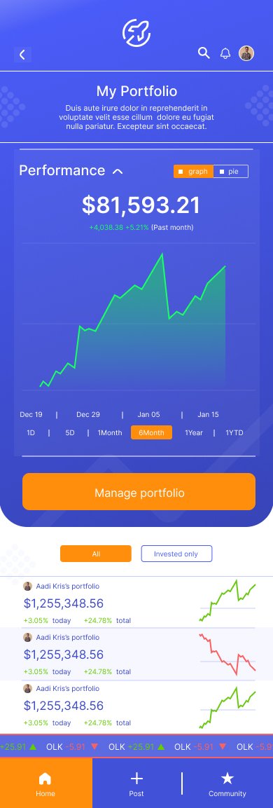
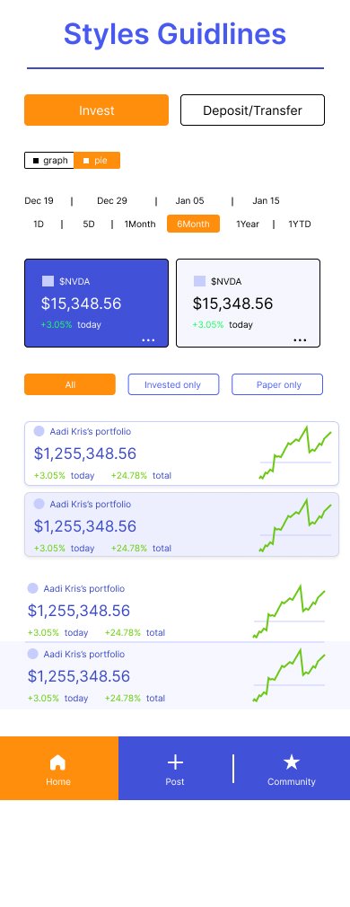
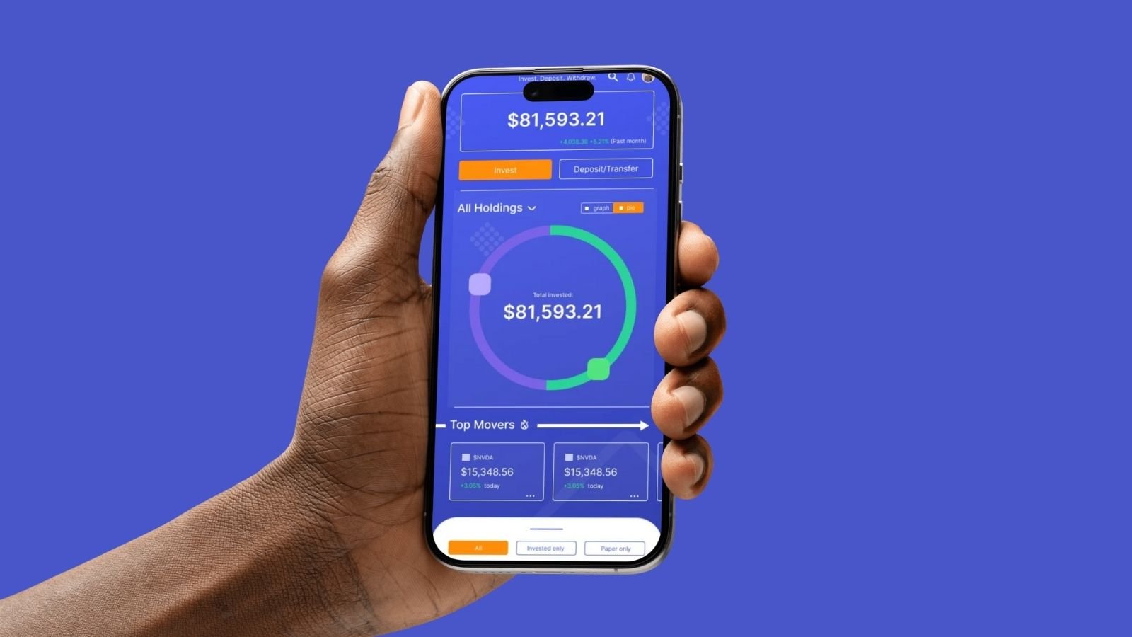
My first step in redesigning the home page was to add the brand colors and logo marks. The next step I took was towards hierarchy and visual readability. The design has a blue background for information on the amount invested and the performance of the portfolio within the past year.
Secondary information is on a white background lower on the page and separated by a compositional element. For mobile first design, we have options to scroll vertically and horizontally. The main page is vertical and the section “Top Movers” is horizontal. We also see an auto scroll element that updates users on the stock exchange.
(Like a ticker) Green when the market is reported good and red when the market is reported bad.


